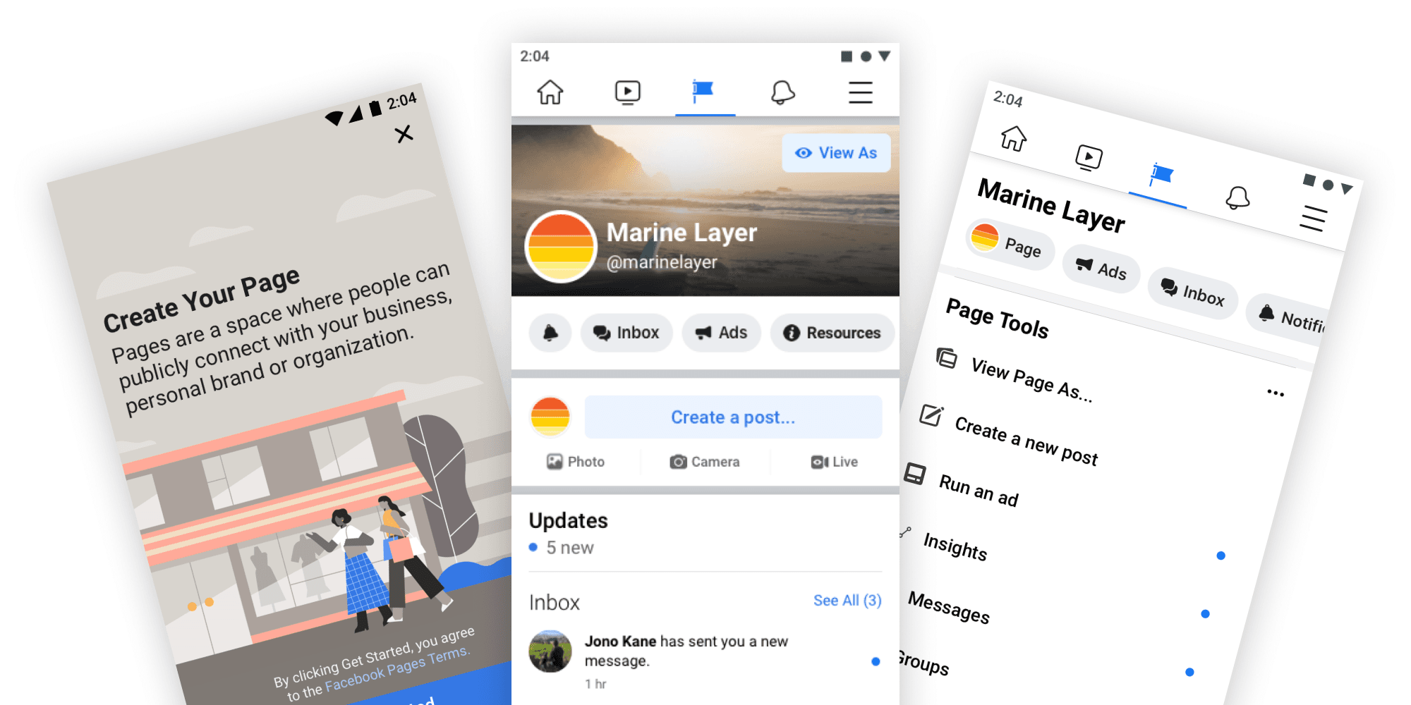
Facebook Pages: the business front door
Put a Pages tab entrypoint in the bottom nav of every business owner on Facebook and cut Page creation to its essential fields
The surface
Pages is the primary surface for third party business presence on Facebook. It is where a bakery, a band, a body shop, or a global brand establishes an identity that billions of people can find, follow, message, and buy from. Meta has said publicly that more than 200 million businesses use its apps every month.
I sat in Meta's Cross-Integrity organization, where the work was focused on growth and business authenticity: making sure the businesses people encounter are who they claim to be. Owning the core Pages surfaces put me at the opposite end of that same problem. Authenticity does not begin at the verification badge. It begins in the first hour, when a business decides whether this platform is somewhere they can actually establish themselves.
Two failures, one funnel
Research kept surfacing the same two.
Business owners could not find their own Page. This came up constantly in qualitative research, and it is a strange thing to hear repeatedly about a product someone deliberately created. The paths in were scattered across the menu, bookmarks, Page tabs, and creation shortcuts, each placed by a different team at a different time, none of them where a business owner would think to look. People had made a Page and then lost it inside the app.
Half the funnel leaked, and the half that survived often died anyway. Creation was a wall of fields. It asked for a complete business identity before it gave anything back. People dropped out midway. The ones who pushed through frequently produced a Page thin enough that it was never used again. Two different failures with the same root: the flow optimized for a complete record rather than a live business.
Fixing either one alone changes nothing. A cleaner creation flow no one can find is invisible. A prominent entry point into a flow that loses people is a faster route to the same dead end.
The Pages tab
The win I am proudest of is a single entry point for Pages.
I spearheaded putting a Pages tab in Facebook's navigational tab bar (iOS and Android), shown only to mobile users who had created a business Page. If you run a business, the way in is the first thing your thumb reaches. If you do not, nothing changes and the app stays exactly as it was.
That conditional is the whole idea. Facebook's primary navigation is the most contested real estate in the product. Every slot is claimed by a team with its own goals and its own numbers, and every change ships to billions of people at once, so the default answer to any request is no. A permanent business tab for everyone was never going to survive that review, and it should not have. Most people on Facebook do not run a business.
Personalizing the slot by user state turned a zero sum fight over pixels into an argument nobody had to lose. Business owners got the front door they had been asking researchers for. Everyone else got an unchanged app. The proposal cleared review on the strength of that framing more than on the strength of the design.
Page creation, cut to the bone
The old flow treated setup as a form to be completed. We treated it as the shortest possible path to a Page that exists, followed by a deliberate campaign to finish it.
Creation was reduced to the minimum viable set of fields: the ones without which a Page is not really a Page. Everything else moved out of the wizard and into structured prompts after signup, surfacing later in context, when the value of filling them in is obvious because the Page is already live and visibly incomplete.
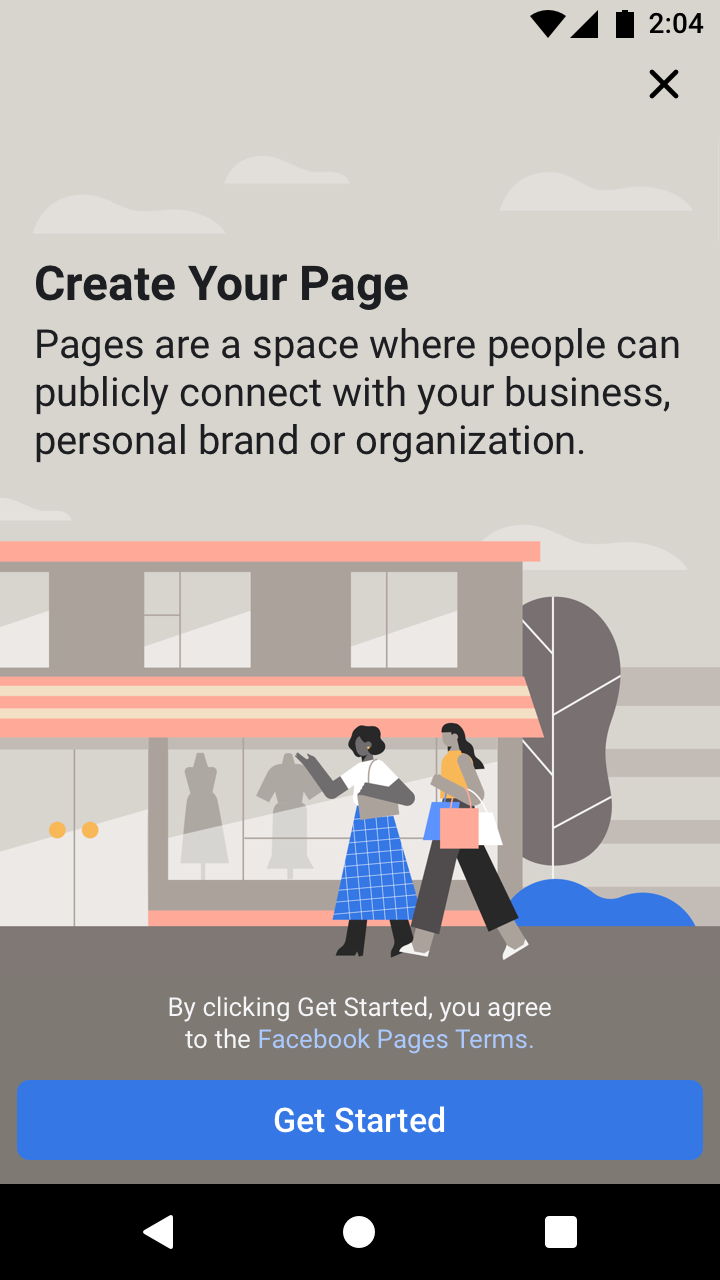
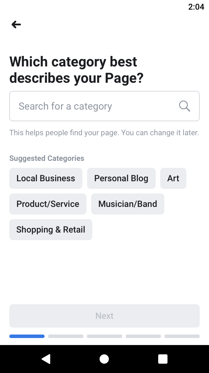
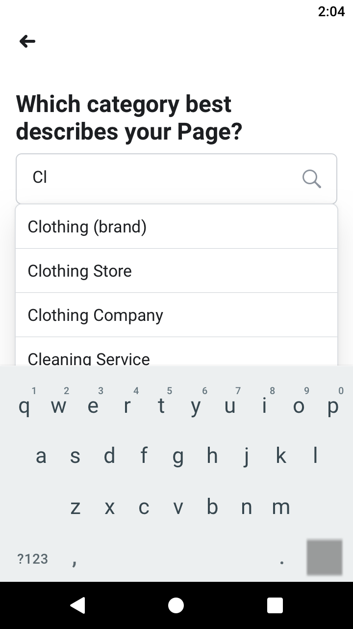
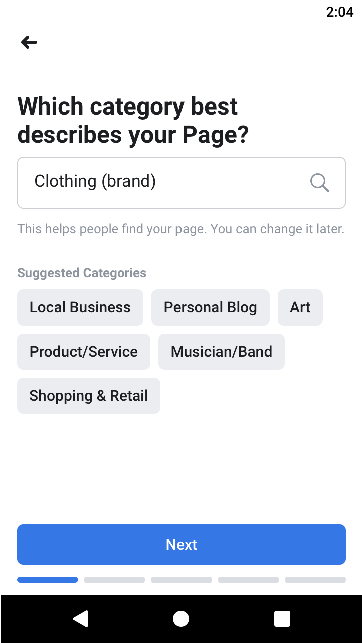
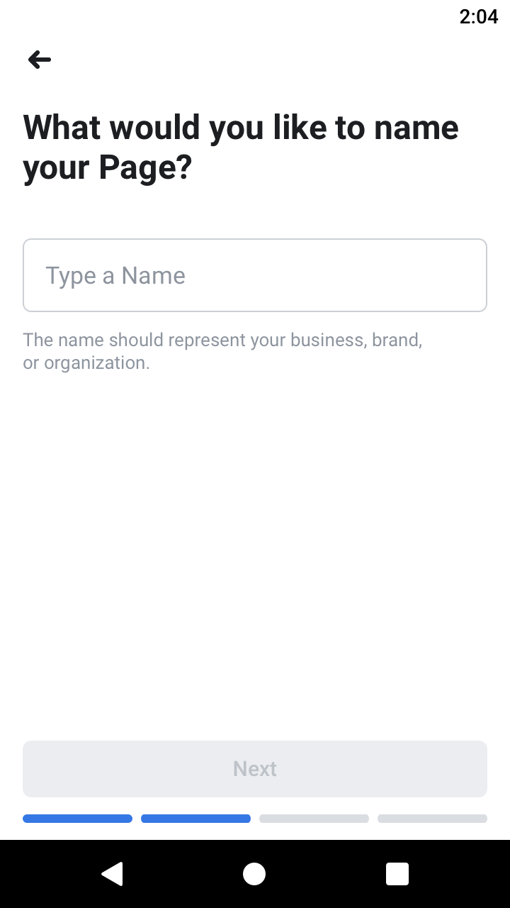
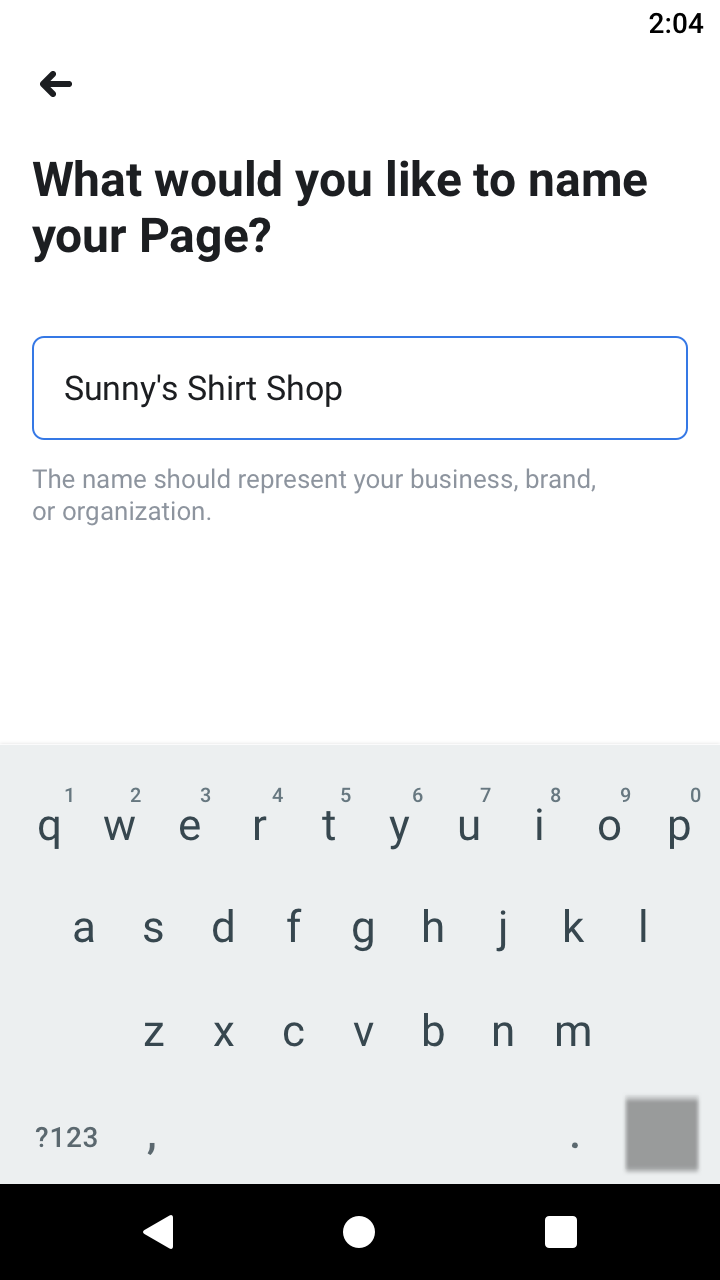
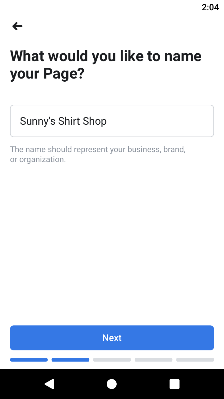
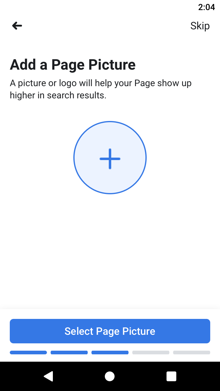
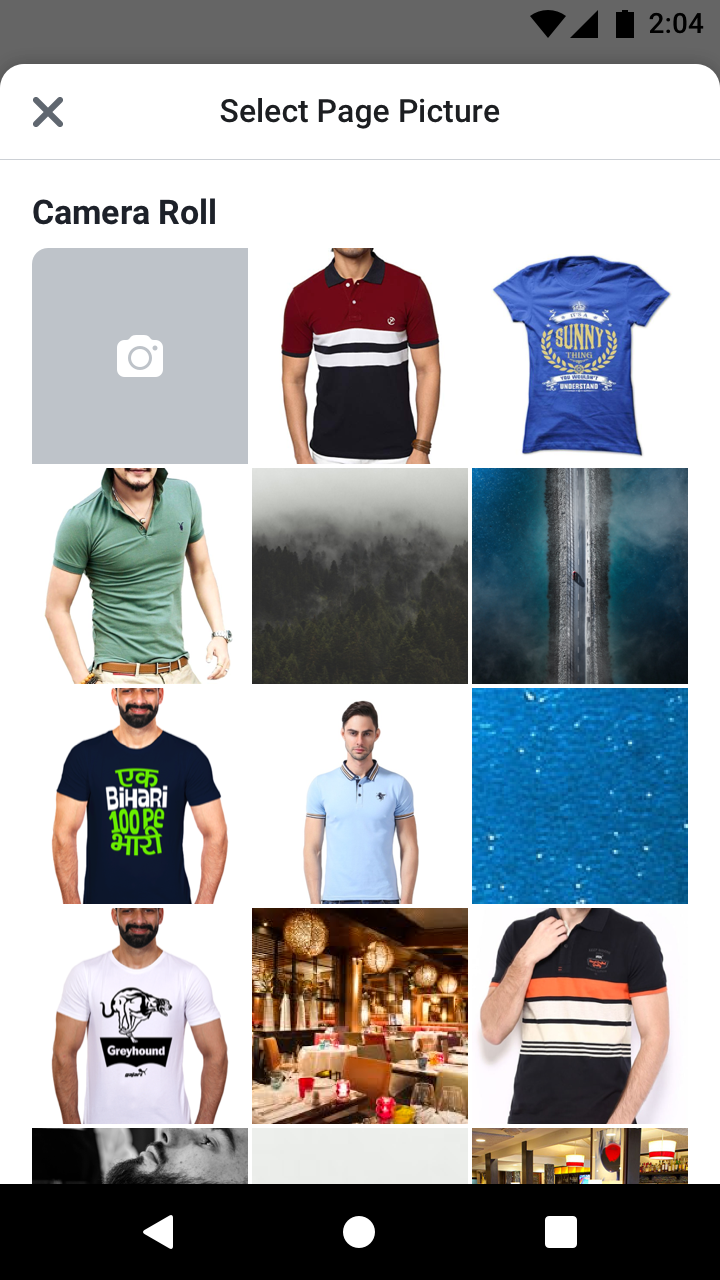
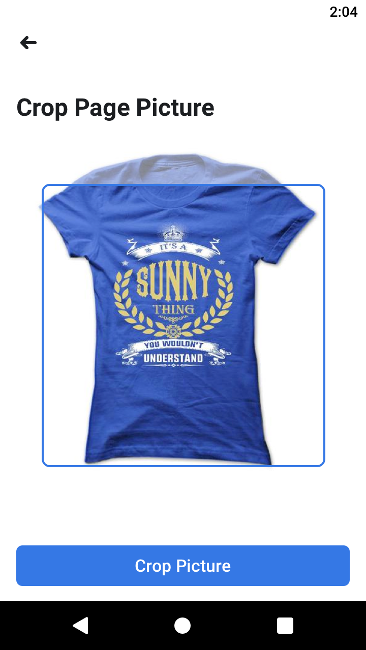
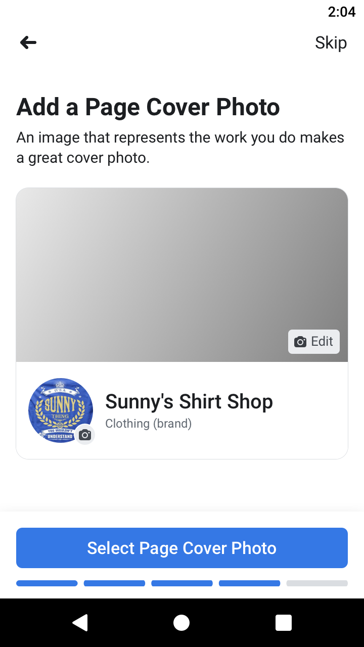

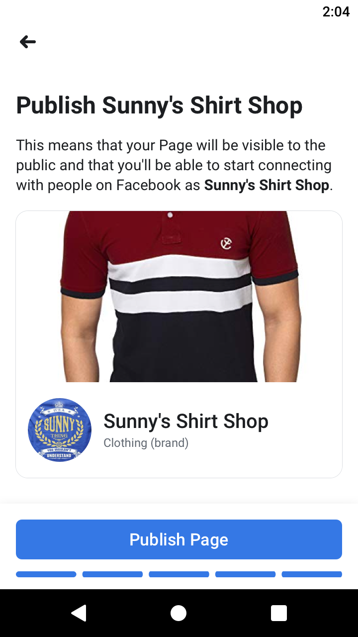
That trade is easy to describe and was not easy to win. Deferring fields means a period where Pages exist in a partial state, which is a real cost to search quality, to categorization, and to the integrity signals that depend on complete business information. The argument that carried it: a fully specified Page that never gets created is worth nothing, and an abandoned complete Page is worth nothing either. A live, partial Page can still be finished. Completion became a retention problem instead of a gate, which is a problem the product is much better equipped to solve.
The prompts mattered as much as the cut, and the pattern we landed on was not a checklist. Rather than telling a new Page owner what was missing, we showed them what other successful Pages were doing with the tool in question: how comparable businesses used it, what it looked like when it worked.
That reframes the ask. A completion meter says you have failed to fill in a field, which is the platform's problem, not yours. An example says here is what this does for a business like yours, which is an argument rather than an obligation. It also solved something the fields alone never could: most new Page owners did not know what these tools were for. They were not withholding information, they were unconvinced it was worth their time, and no amount of persistence fixes that. Showing the outcome first is what made the prompts feel like help instead of nagging.
Integrity as a design constraint
Reducing friction in business creation is not a neutral act. The same flow that lets a legitimate business stand up in ninety seconds lets a bad actor stand up a convincing fake in ninety seconds. Sitting in the integrity organization meant every field I removed had to be evaluated against what it was doing as a signal, not just what it was costing in conversion.
This is a discipline I have carried into everything since. The fastest path is not automatically the right one, and the teams that learn that early build products that survive contact with people who are not acting in good faith.
What shipped, and what I lost
The Pages tab and the reduced creation flow both shipped. This work fed directly into the New Pages Experience, the platform-wide migration of Pages onto a new model that rolled out in 2021 and which I was part of.
I also lost one. I argued for a substantially larger Pages presence in Facebook's main menu, and we were outcompeted by other business units with stronger claims on that space. My read now is that the pitch was wrong rather than the idea. I made a case built on business owner need. The teams that won made cases built on revenue. Had I tied the request directly to ads creation, which is where a business owner's next step actually leads and where the money is, it would have been a different conversation.
I know that because it is what eventually happened. Later, separately from anything I pushed for, the team leaned into ads creation in the main navigation, and that was where the win was found. The placement I wanted was reachable the whole time. It just needed to arrive attached to revenue rather than to need. That lesson is now the first thing I check before walking into a prioritization review: whose number does this move, and can I say it in their language.
Credit
I led design for the Pages entry point and first-time experience work described here as an individual contributor, partnering with product management, engineering, content design, and UX research. The qualitative research that anchored the Pages tab argument was not mine. I was promoted to product design manager in 2022, after this work, and continued to contribute hands-on design while leading designers across Business Integrity initiatives.